S

FT5 System Design

Atomic Design

Atomic design is a mental modal for understansing how we break down interface design systems in a molecular method. It helps you better see how things are connected, from the most abstract part of the design to the most concrete.

Design Tokens

Basic design variables that define visual design parameters (fonts, colors, spacing)

Atoms

The simplest UI elements that make up the interface (icons, buttons, checkboxes, radio, inputfields)

Molecules

Combining atoms together to create functional groups (input field + button = searchbar)

Organisms

Complex components combining molecules and atoms to solve problems (product cards, order forms)

Templates

Page layouts showing how organisms, molecules and atoms combine into common structures.

Pages

The final template implementation filled with real content, data and Images.

01.

Typography

In our typographic system, each text style is defined as a unique design token. These tokens ensure consistency across all interfaces by standardizing how titles, subtitles, and body texts are used throughout the design. The system defines hierarchy, scale, and usage for every text element.

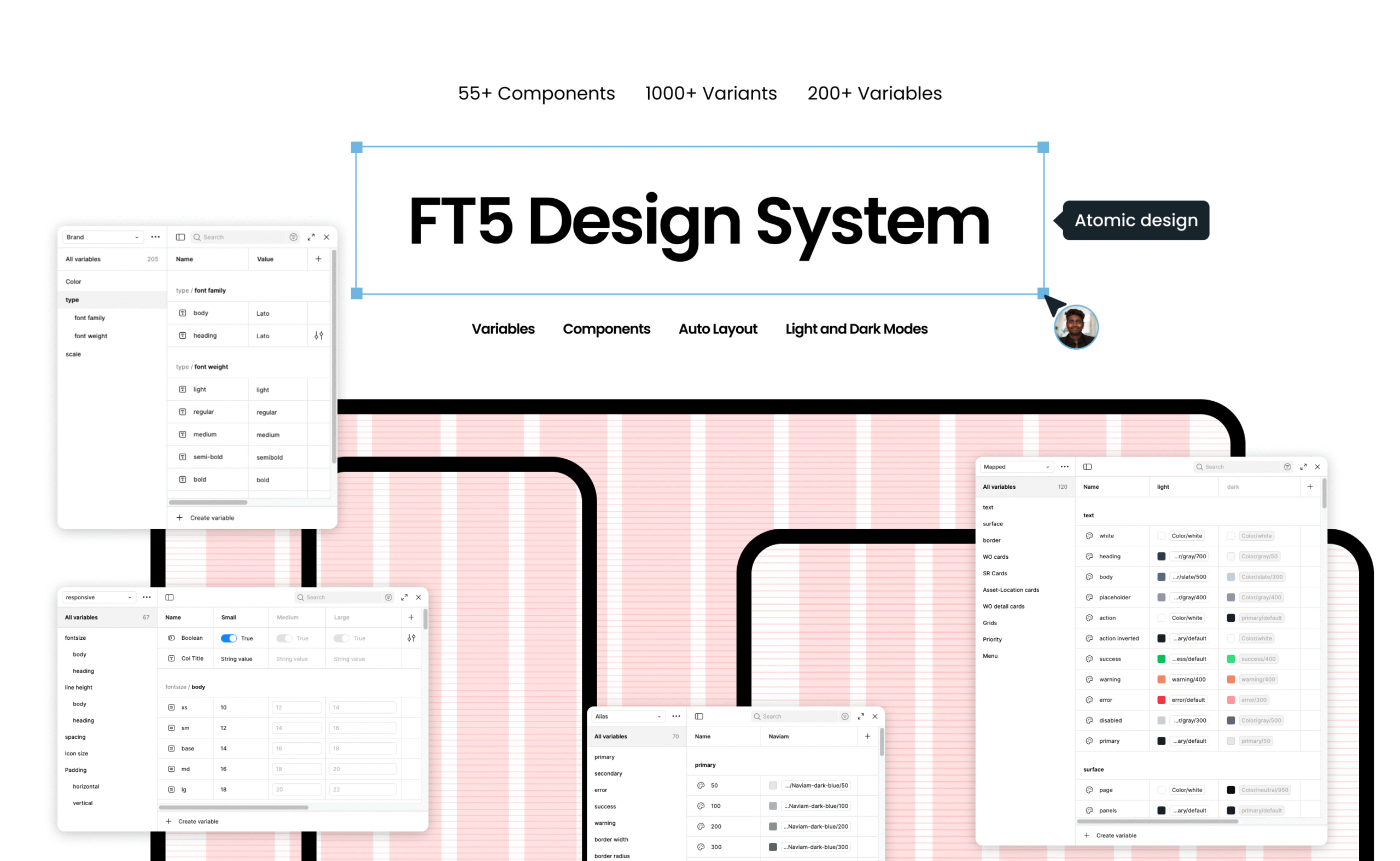
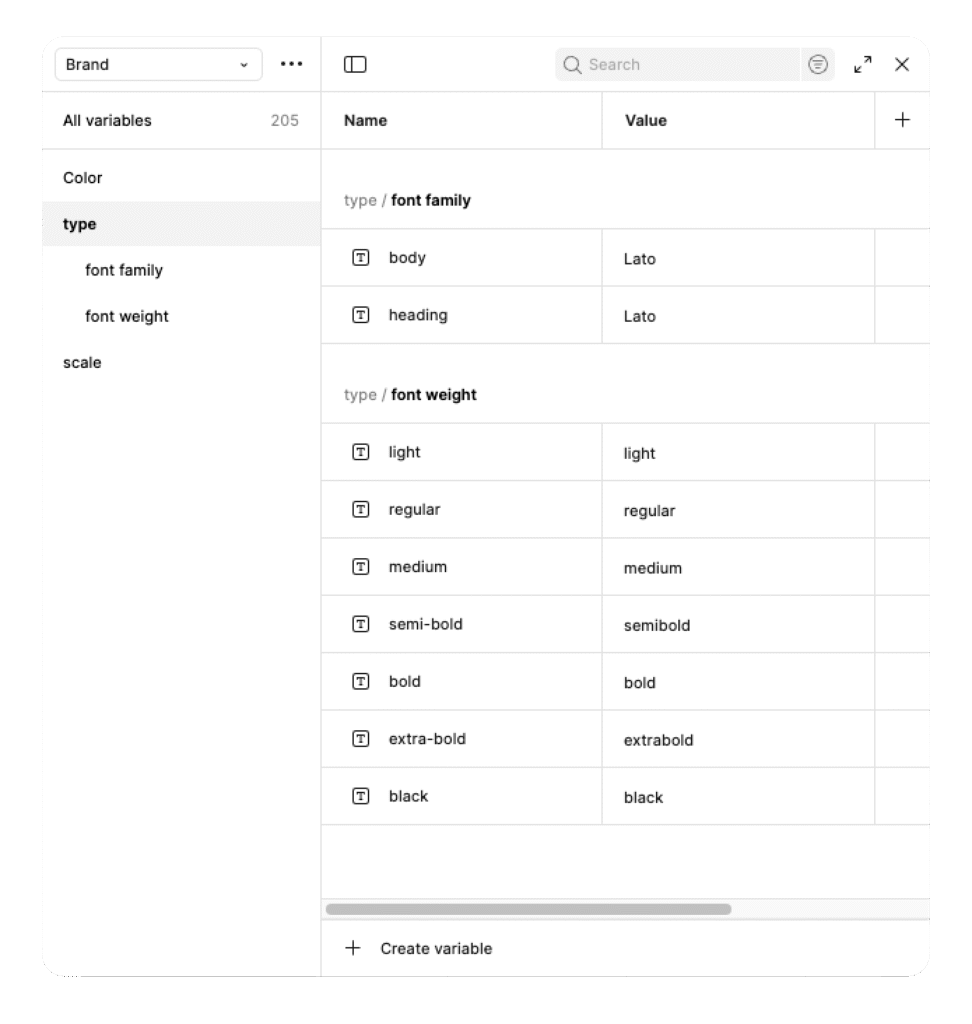
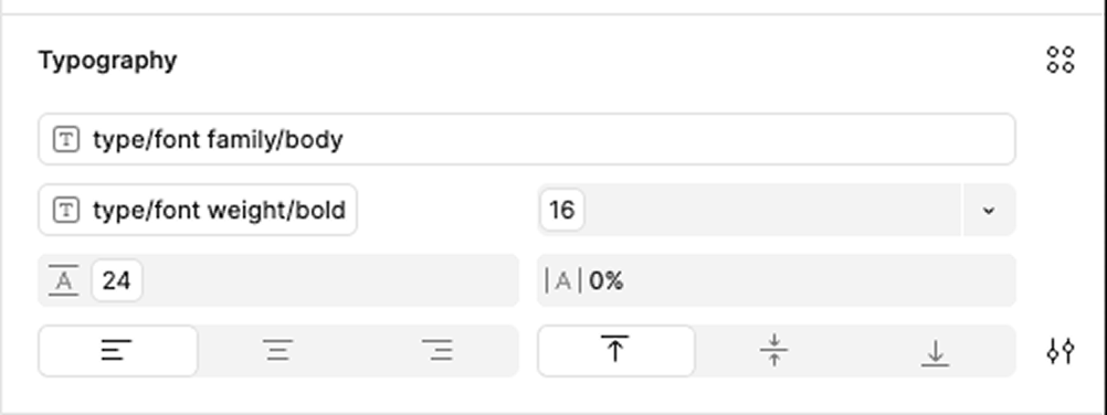
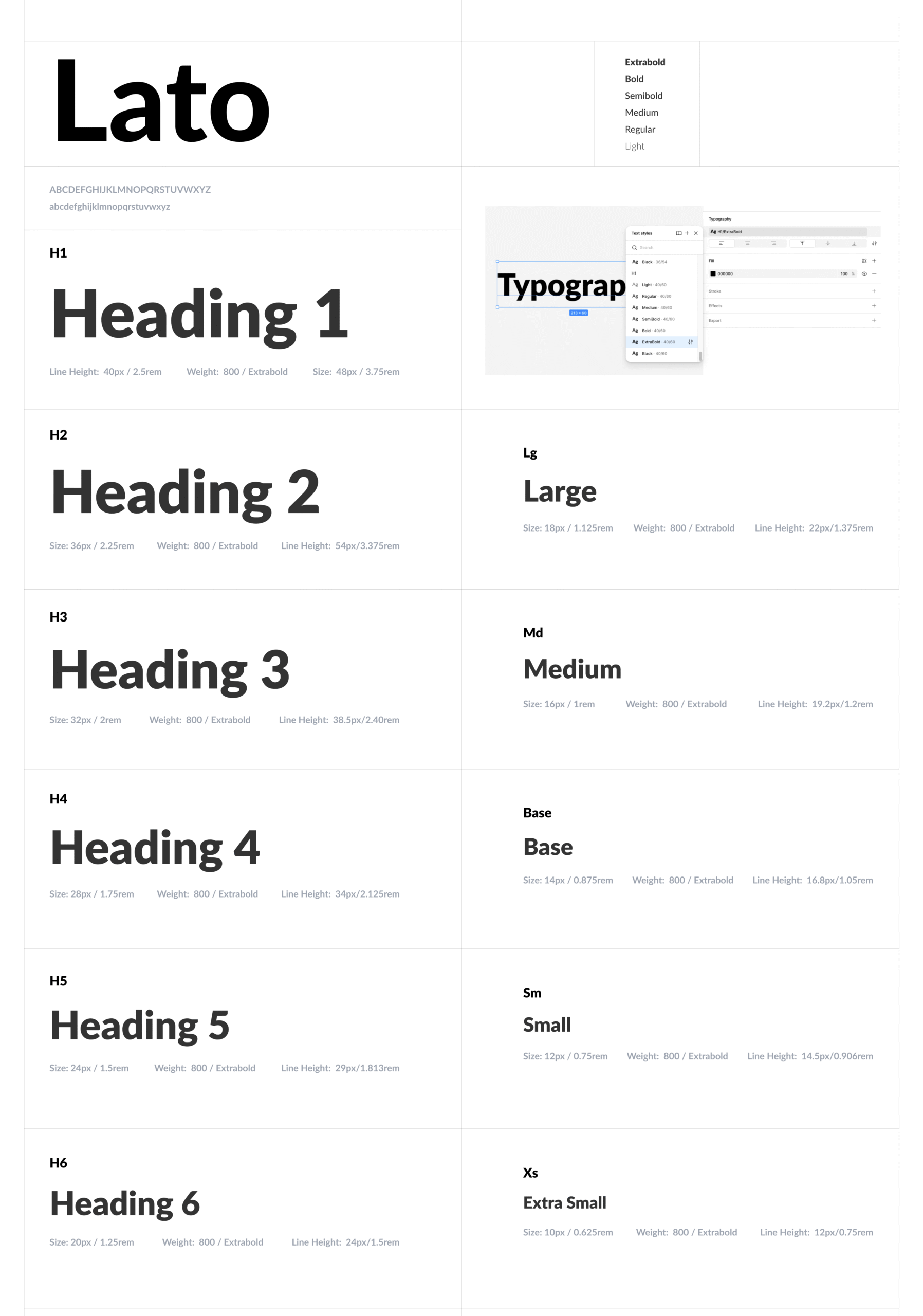
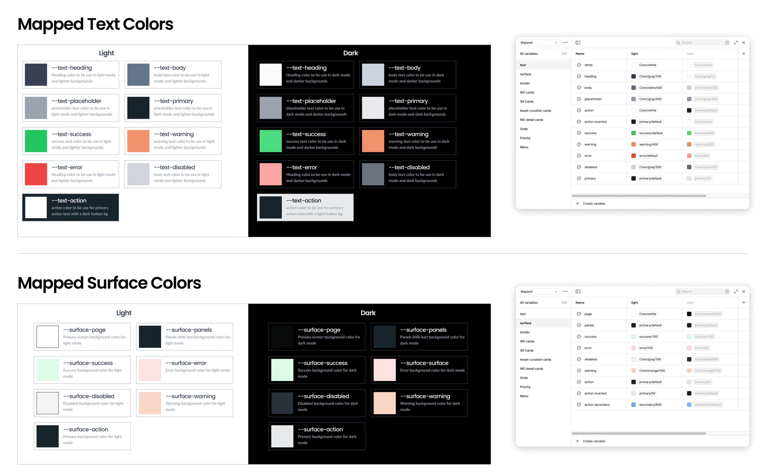
The typography setup maps design tokens directly to font properties for consistency and scalability.

Each text style, like headings or body, pulls values from predefined variables such as type/font family/body and type/font weight/bold, ensuring automatic updates across all components whenever a variable changes.

This structure allows to maintain harmony while keeping every text style dynamic and fully customizable.

02.

Spacing

Spacing in the design system follows a 4-point grid for visual consistency and scalability. As an exception, a 2-point unit is also available for tighter layouts or minimal spacing needs. These spacing values should be applied between and within components to maintain rhythm and balance across the interface.

03.

Corner Radius

I use a modular corner radius system based on a consistent 4-pixel increment to ensure visual harmony and scalability across the interface. This approach helps me maintain a cohesive, balanced look while allowing flexibility to adapt corner styles for different components and layouts.

04.

Colors

My color system is built using custom variables that include brand colors and mapped color variables for consistency and flexibility. It features Naviam dark blue as the core brand color and Naviam light blue as the accent, supported by a system of color palette. Both light and dark themes are fully supported for adaptive design.

Brand Colors

Mapped Colors

05.

Shadows

I designed the shadow system to establish visual hierarchy and depth within the interface. It’s built on a set of consistent elevation levels that are applied across components like cards and modals, ensuring a clear and cohesive sense of layering throughout the UI.

06.

Icons

The Icon pack is based on material design icons and ionic icons, a comprehensive, open-source set, combined with a set of inhouse custom icons to meet the design requirment. They are scalable, easy to customize, and designed for clarity at all sizes for maximum consistency.

07.

Buttons

Buttons form the foundation of our interactive design language. This system defines consistent styles—Filled, Outline, and Ghost—across all states, colors, and sizes. Each button scales from extra small to large, supporting icons and labels with balanced spacing. Designed for clarity, accessibility, and hierarchy, these buttons ensure cohesive usability across light and dark themes.

07.

Input fields

Input fields are designed for clarity, consistency, and accessibility. This system defines floating and stacked layouts with clear validation states—default, active, success, and error. Each input supports icons, labels, and placeholders with balanced spacing. Scalable across themes and sizes, these inputs ensure seamless interaction and visual harmony in both light and dark modes.

More components upcoming...

Cart (0 items)